Katie Blechinger // Copywriter
Curtis Kiser // Art Director
Gil Templeton // Creative Director
Dan Draper // Associate Creative Director
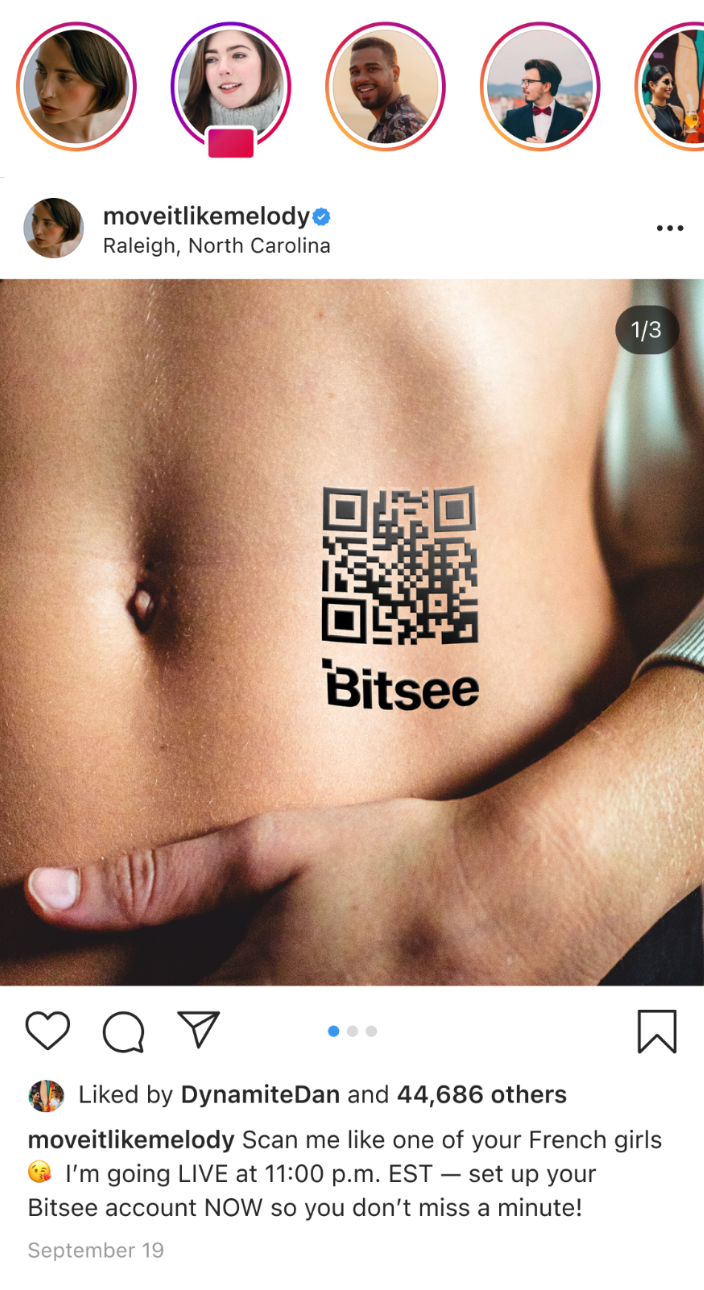
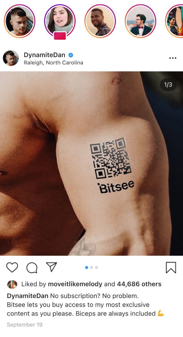
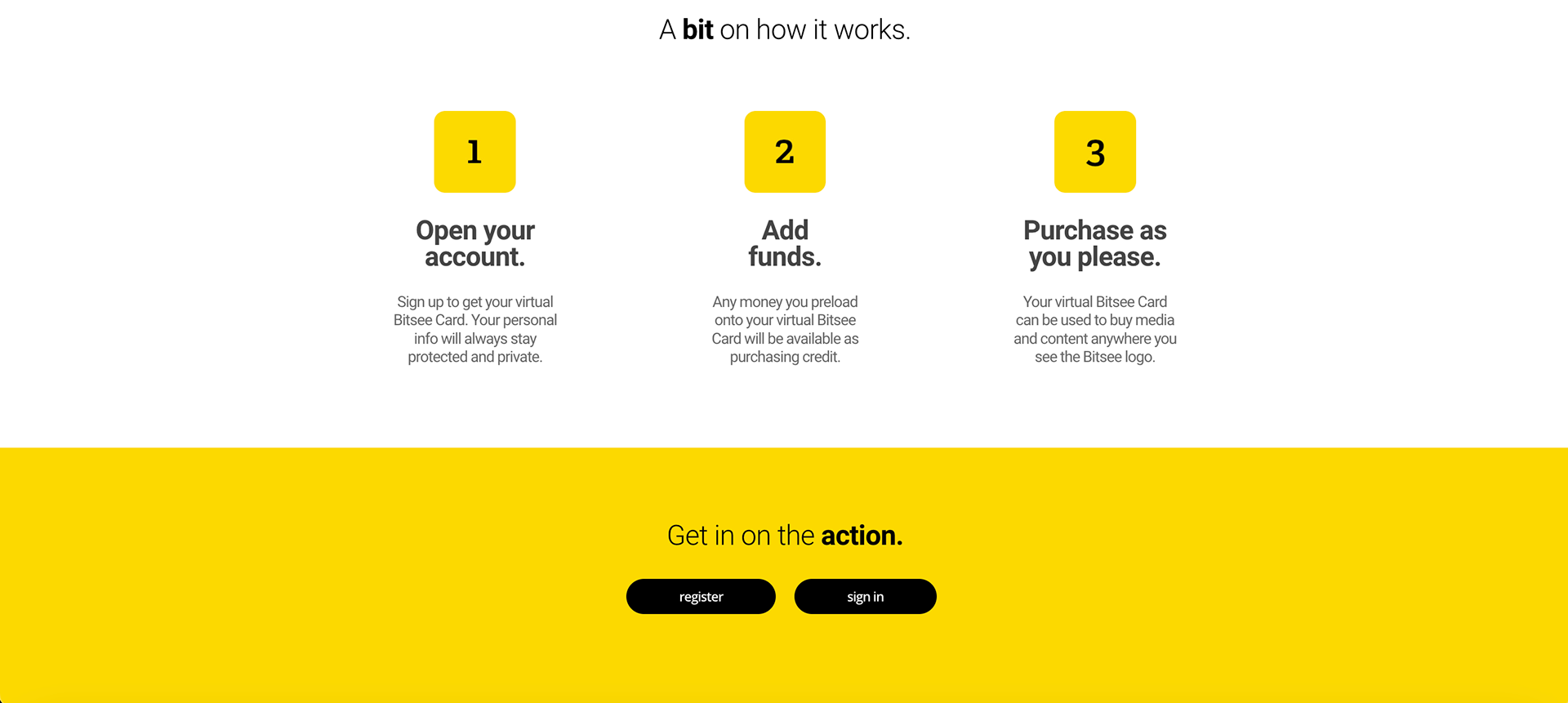
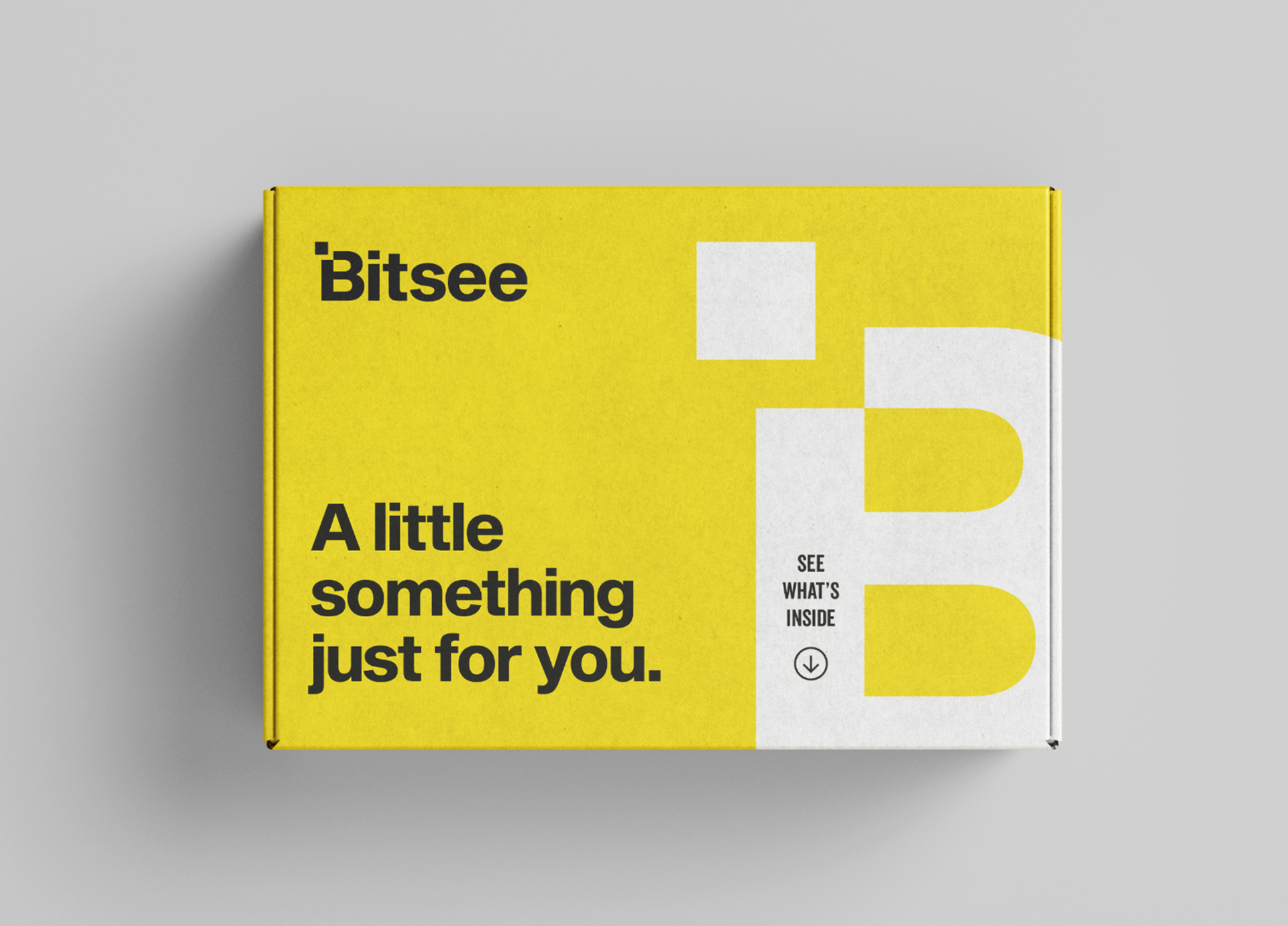
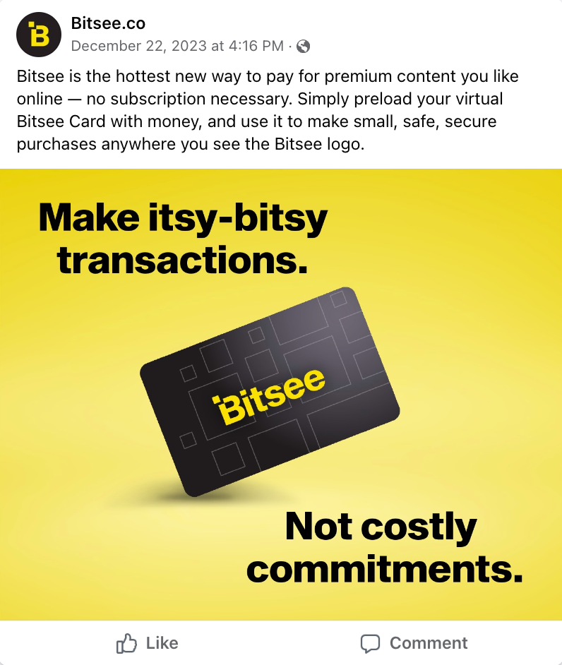
Pay a little bit to see something with Bitsee — a micro-payment platform for one-off purchases from adult entertainment sites.
When users are faced with a subscription barrier, Bitsee gives them the option to make an itsy-bitsy transaction instead of a costly commitment. This way, they can access the specific content they want, without getting charged for it all.
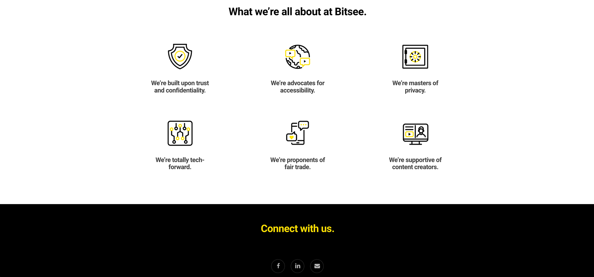
Our team created an ownable identity for Bitsee that would help the brand build awareness, trust and recognition.
Branding
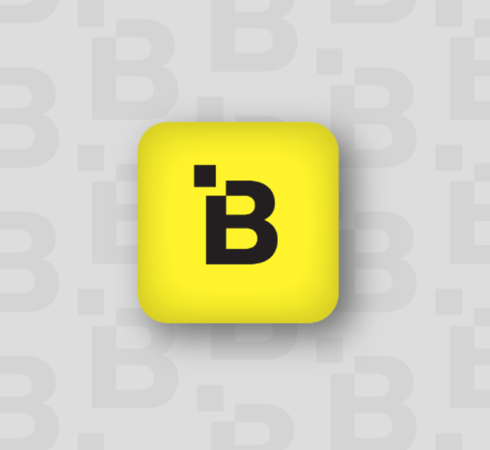
Logo
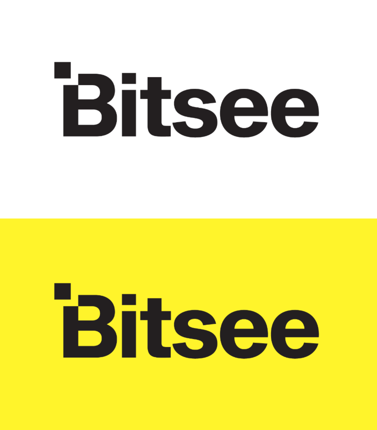

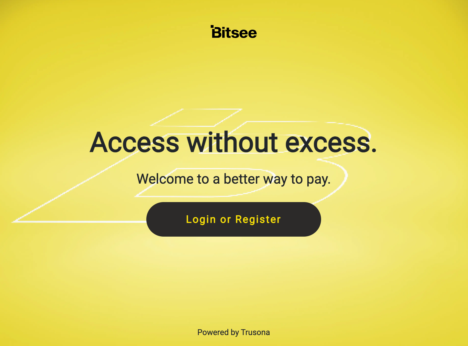
Our logo embodies the essence of our brand. The two variations, the full wordmark (“Bitsee”) and the single-letter icon (“B”), are designed to be scalable, legible and easily recognizable.
Both versions feature a modified capital letter “B,” shown with the top left corner cut out and separated from the rest of the logo. This represents the action of our users picking and choosing what they engage with, and thus, pay for. The freedom to be selective and curate one's own experience is what sets us apart, which is why it’s so closely tied into our visual identity.
Our logo is set in Sequel Sans. It’s bold, clean and legible, speaking to who we are as a brand — modern, dynamic and committed to delivering a trustworthy, hassle-free user experience.
Color Palette
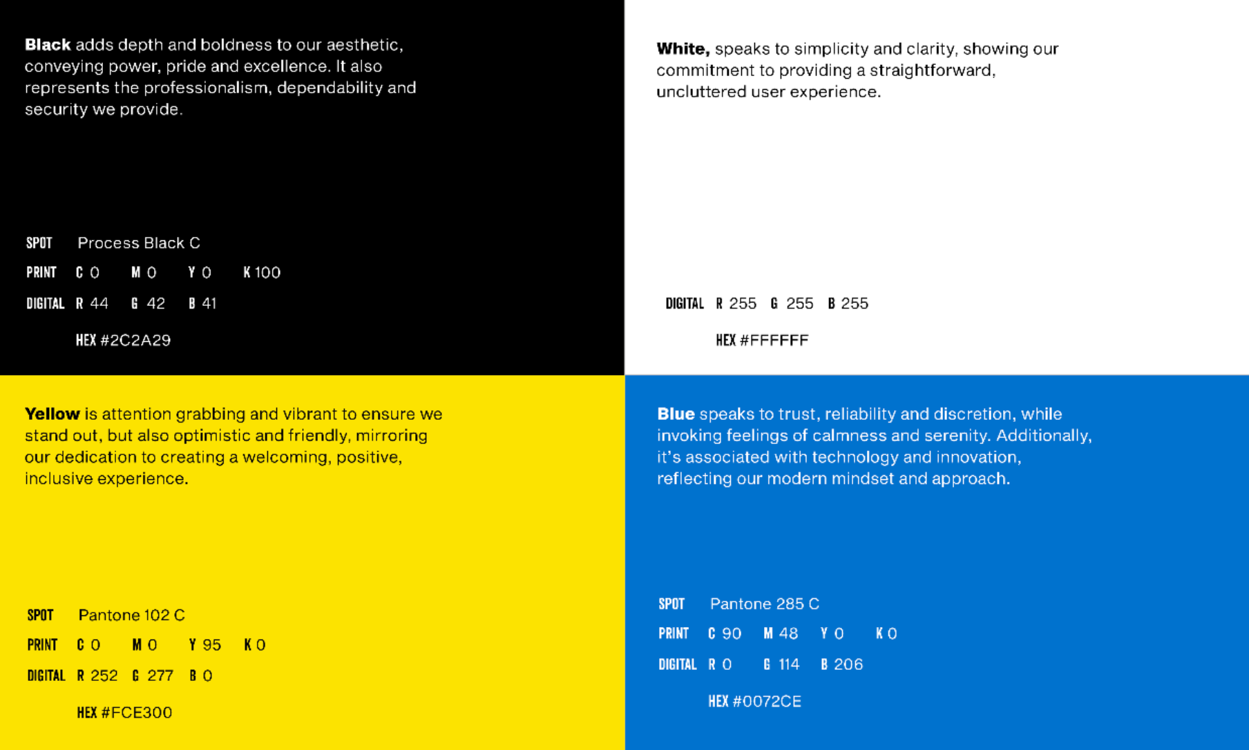
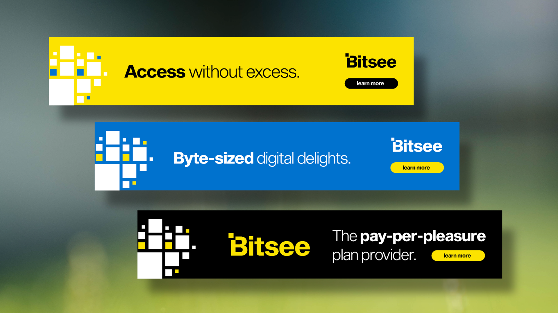
Our color choices are versatile and universally appealing, allowing us to cater to a diverse audience with varying interests. When used together, our colors yield high visibility and a level of contrast that’s both well balanced and eye-catching. The resulting combinations are visually pleasing, but also serve the greater purpose of helping us build recognition.
Website
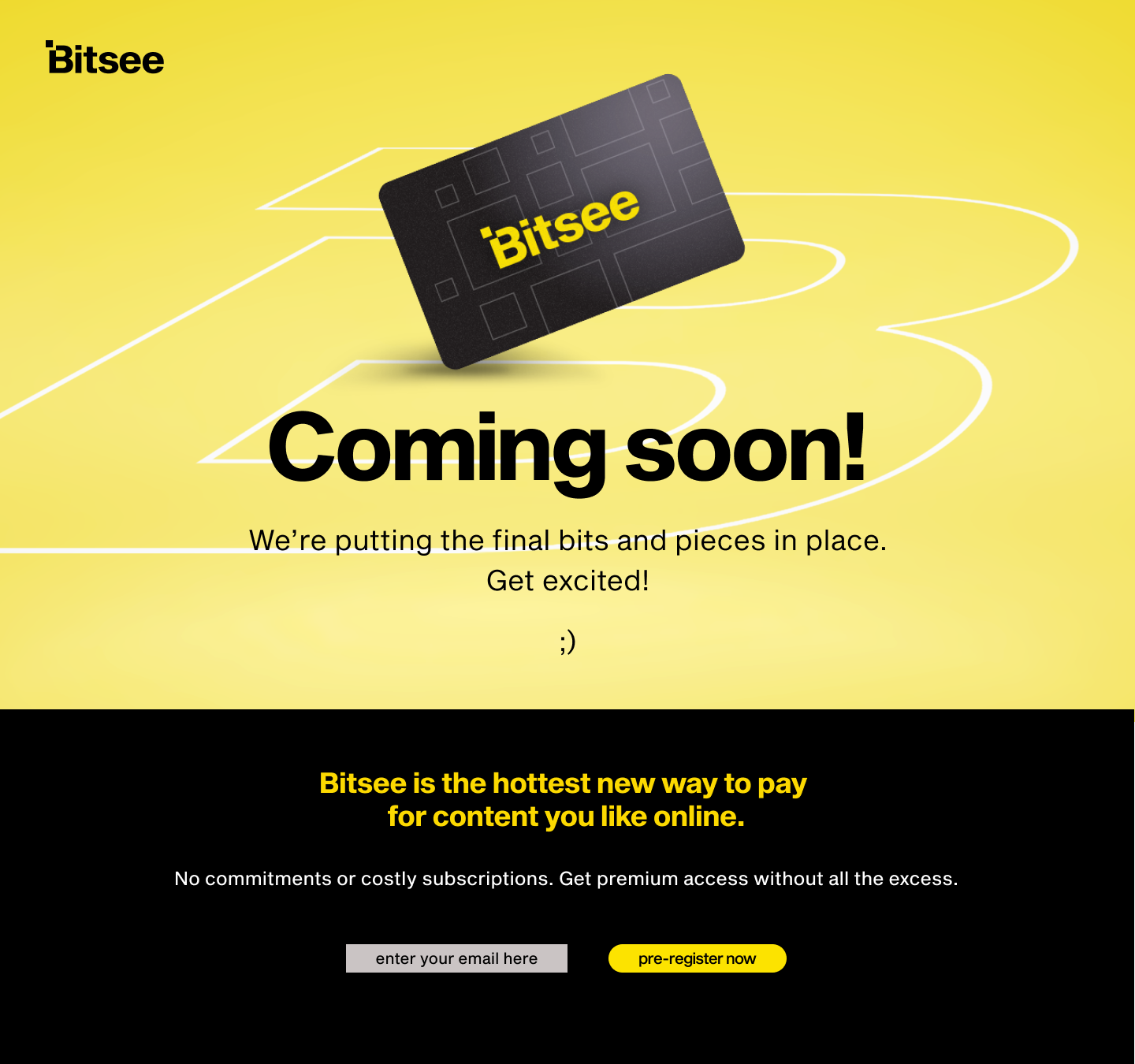
Coming Soon Page
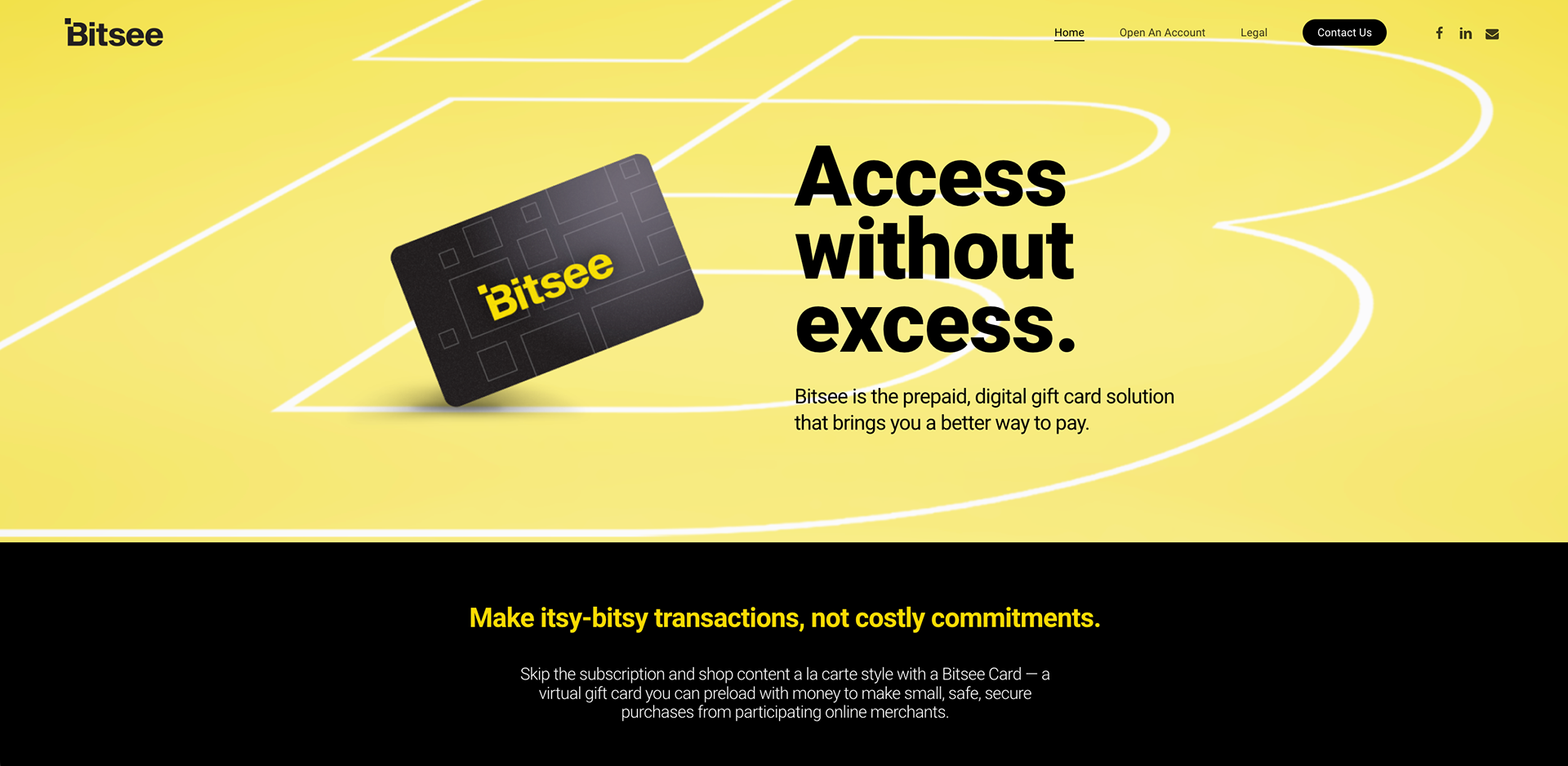
Landing Page
Account Tab
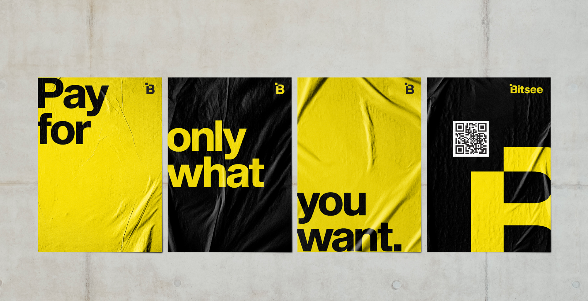
Print + Out of Home
Posters
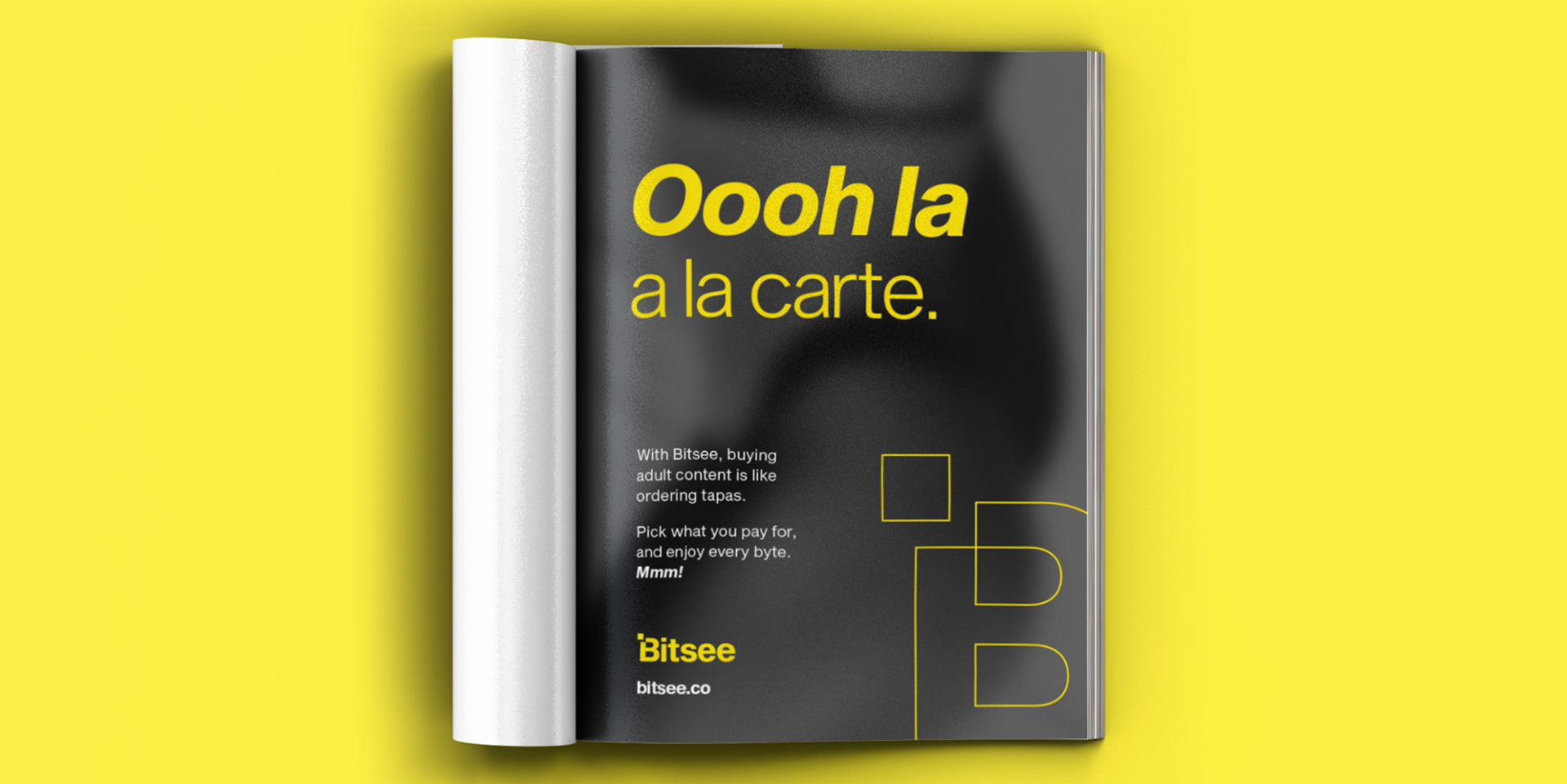
Magazine Ad
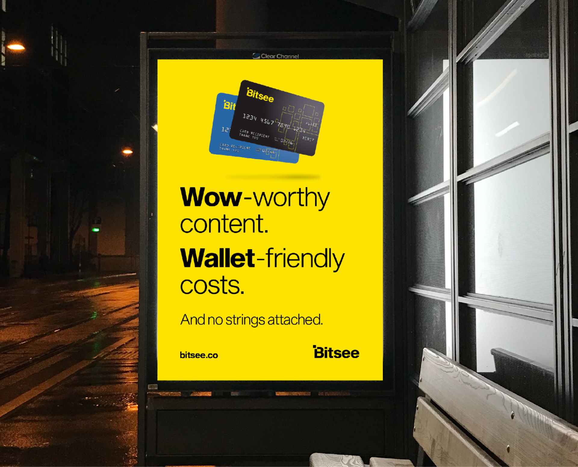
Transit Ad
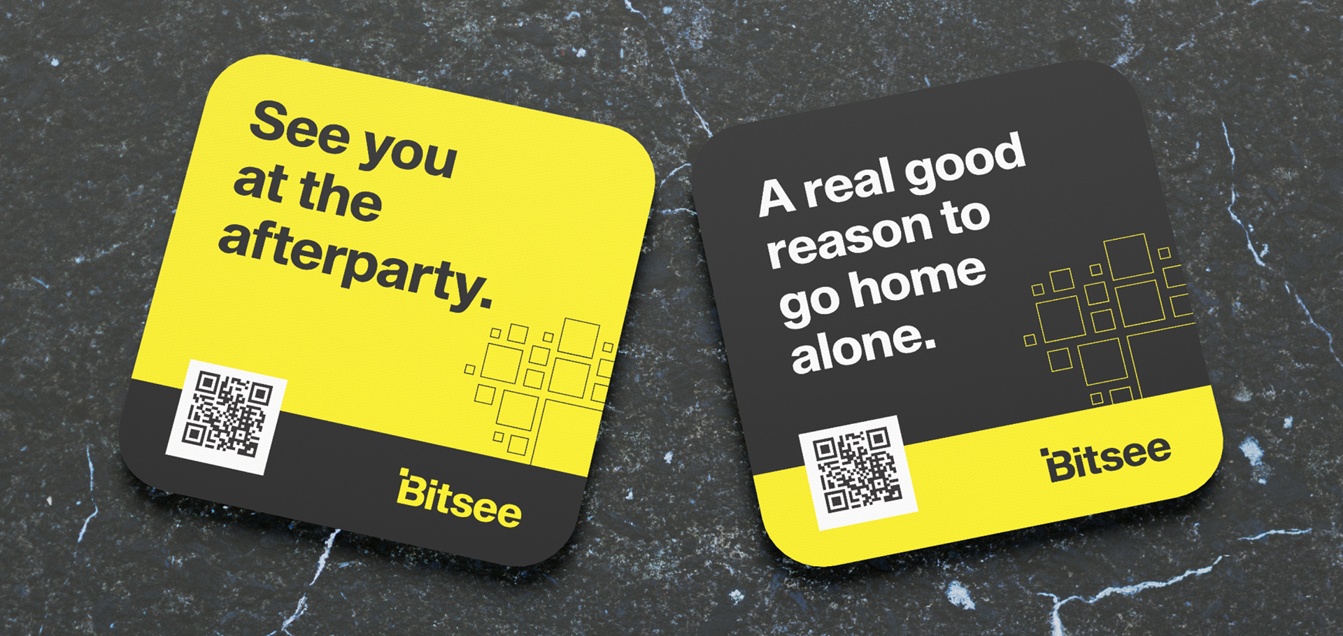
Coasters
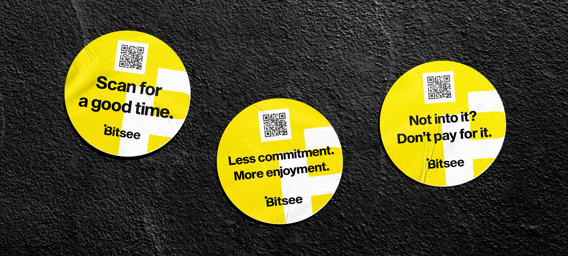
Stickers
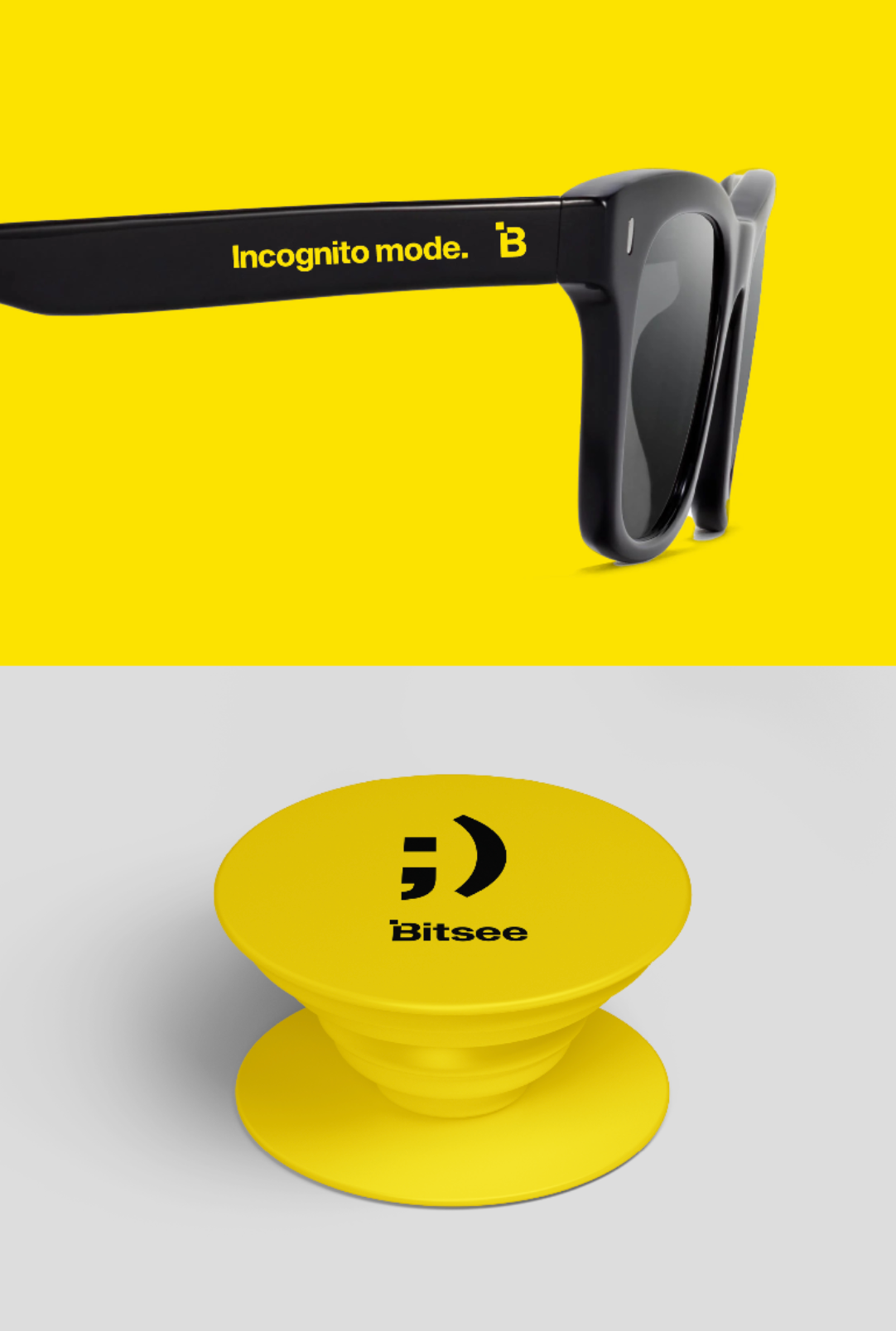
Promo Items
Digital
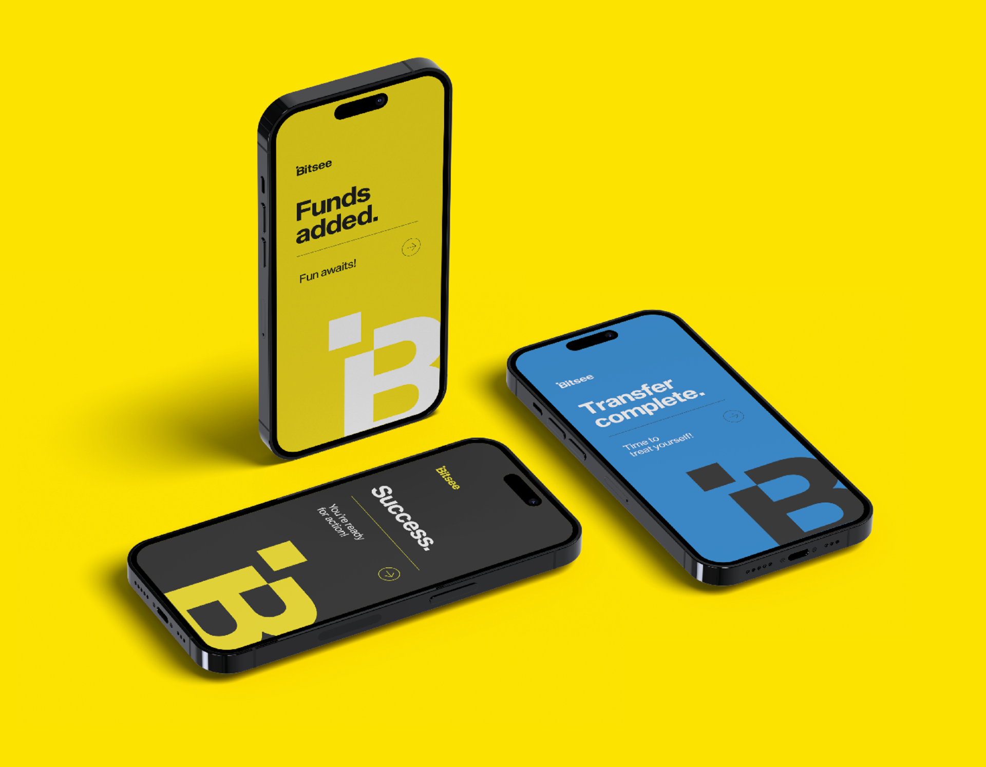
Confirmation Screens
Banner Ads
Social Media
Brand Posts

Influencer Posts